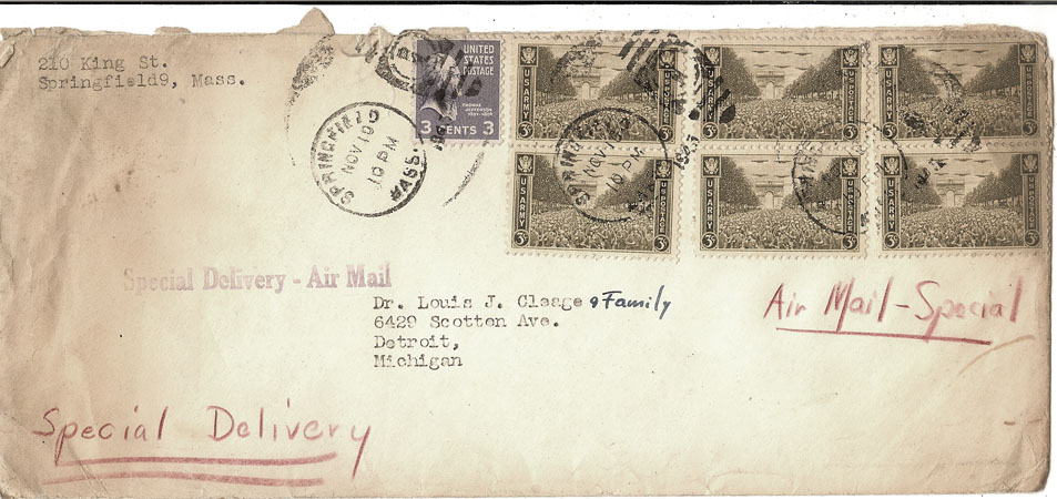
November 10, 1945
Hi Folks:
Well, you-all know all the news (I told you everything over the phone)…but you-all should have been at the Fellowship Dinner!!! We (the Committee) started setting up the “dining-room” Tuesday evening. They ab-so-lute-ly refused to believe that there would be more than 150 people present… “Ain’t never had more’n 150 people.” they said…and that was that. So I had to start “setting-up” for the other 150 myself. A few of them… not wanting to hurt the preacher’s feelings… humored me and helped …We set up every old piece of table there was in the church …The supper-tables only seated about two hundred including those we had to fix with improvised legs and that…we then used the Sunday-School tables ( a little-low in as much as they were for the primary department!!) and the Sunday School Sand-box with a cover over it…and everything we could find. All of the time we were a-fixing my officers would “console” me by saying that “It just can’t be done even if 300 people did come…which they wouldn’t… We’ll just have to eat in shifts…and go up stairs for the ‘meeting’.”I tried to explain this was a FELLOWSHIP supper and there wasn’t going to be no “Church-meetin’ wringin’ and twistin’!!! But somehow they couldn’t hear me. They been a itchin’ for a “meeting” ever since I got here so they can argue about what happened eight and ten years ago and all get mad all over again. Things are going along too peaceful for them…Everybody is too happy and contented. Well, finally we got set up for about 285. I dragged some more tables out into the corridor at the foot of the steps and told them to set them up too…They drew the line there, that was just foolishness. There wouldn’t be over 150 people…and we had already set up for 285…and now the preacher was trying to set up little tables out in the hall! Well, I put chairs around them anyhow… I had insisted that we borrow seventy-five extra chairs from the undertaker. The women then set up the tables…and Doris and one of her buddies went wild with crepe-paper around posts and that. Then I took out all of the little “money-saving sixty watt bulbs” and bought a whole new set of 100 and 150 watt bulbs…and then some of the ladies brought flowers… and Doris brought her candle-sticks and candles n’ that…it began to look like a banquet! AND EACH STEP WAS TAKEN OVER GOOD PESSIMISTIC MEMBERS DEAD BODIES…BODIES WERE STREWN EVERYWHERE BEFORE WE GOT THROUGH. The man who was to cook the dinner was my buddy, however. He took my word for the number of people. I told him 300 people and he prepared for at least 300 and just went on carting in truck-loads of provisions while the rest spread gloom. We (me and Doris) got through “preparing” as though 300 were coming about 6 o’clock and rushed home to take a bath and rush back.
We got back at 7 sharp. A member stopped and picked us up as we waited for a bus or we would have been late…AND THERE WERE CARS FOR BLOCKS AROUND THE CHURCH…We could hardly get in! The dining room was already full!!! And people were lined up on the stairs trying to get down…and sitting around in the social room waiting for their turn. The Committee had just “gone all to pieces”!!! The lady who was in charge hasn’t recovered yet. Dr. and Mrs. DeBerry were sitting off in a corner looking big-eyed. The speakers table up front on the stage was empty. (Dr. DeBerry was to speak of “St. John’s History”. I collected the DeBerry’s …The Senior Deacon and his wife and the Treasurer who were to sit at the speaker’s table and set them down and then acted as head-waiter. I crowded people in where it didn’t look like another sardine would fit. The CHAIRMAN of the committee had about five girls (UNTRAINED) to serve!!! Other girls and men “VOLUNTEERED” and gradually the food began to issue forth in a growing trickle from the kitchen. The people were very nice about everything..Actually I think it was a better FELLOWSHIP dinner because more of the GUESTS had to pitch in and help…Well, finally we actually seated about 325 people. Some would eat and then get up and help serve the others. The place was JAMMED and PACKED. We had some group singing. Oh YES. The treasurer sat next to me on the platform whenever I could get to the platform…and even as we were eating dinner he “ADVISED” me that it couldn’t be done, we’d have to adjourn to the church auditorium for the “MEETING”. I told him we’d do it over my dead body…Finally we were all eating and we had group singing…Our Choir Director is a large uninhibited woman just made to lead group-singing…then we had a couple of numbers by two girls…and then Dr. DeBerry talked…He made an excellent talk…Told them little anecdotes about the church…and what a wonderful person I am…and how they had to get behind me and do what I said…and how the Lord had guided him to Springfield …and had guided him in his work…and when he had to put down the burden had guided me here to carry on, etc. etc. He struck just the proper light tone…and the proper PEP MEETING approach…Then I ANNOUNCED and THANKED…Those who had distributed tickets…those who had agreed to be Group-Leaders…and told ’em we’re going to build a parish house…buy a Moving-Picture Projector etc. etc. The Sunday School Superintendent showed them the Slide projector we just bought…(They were impressed). I introduced the CHEF and he made a little testimonial speech about the church being the best church in New England…and The Chairman of the Committee thanked those who had helped..and we sang Old-Ang-Syne (I ain’t even gonna try to fix this one!) and then Fellowshiped for a while. Everyone had a good time…Dr. DeBerry said there were people out who hadn’t put foot in the church since he left…etc. etc. Almost our entire membership was present. The men stayed and took down the tables etc. Some wanted to take up an offering but I refused.
