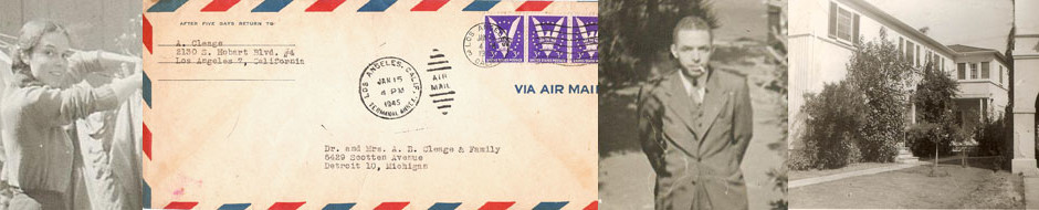
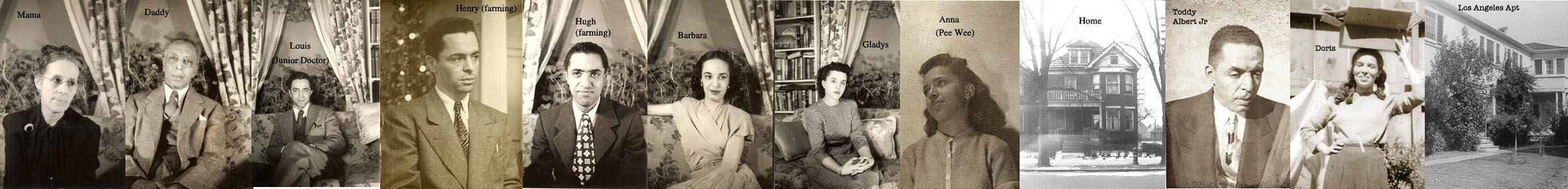
This letter should have come before the previous post where my father writes about lecturing on his Design Theory. “Gravi” is his younger sister, Gladys who was an art student at Wayne State University in Detroit at the time. Below is a strip photograph of all the Cleages, the house on Scotten in Detroit and my parents and their apartment in LA. This is how they looked at the time the letters were written and how they were identified in the letters. If you click it, it will enlarge and you can enlarge it again which makes it big enough to see.
2130 s. Hobart Blvd. #4
Los Angeles 7, California
December 20, 1944
My dear Gravi:
I have a little problem in “Design” for you to work out for me during the Christmas vacation. (If your hectic love-life and gadding about permits of the time.) ‘taint very important, if you’re too busy.
I want you to work out some little designs (like the one you did breaking down the picture into abstract lines and masses for your first course in design…remember…you used show-card paint.
I have developed a “theory” of graphic design which I would like to illustrate. It goes as follows. All design is based upon the principle of dialectic tension and progression…moving (just as Marxian social-change…remember social-causation) from THESIS to ANTITHESIS to SYNTHESIS and BACK TO A NEW THESIS. I want abstract designs to illustrate the three stages of development and two to illustrate the proper transition between them. I will describe just what to do to design each stage as follows:
THESIS represents security…peace…calm…status-quo…the power of order… stability …etc. It is essentially unpleasant unless you are somewhat akin to a clod. It represents the Middle-class ideal…the bourgeois unconscious. it is usually used in picture of New England churches etc…There is balance…with the emphasis upon spaciousness (figures are not compactly massed)…and HORIZONTAL LINES combined with VERTICAL LINES (both boldly done. THERE ARE NO CURVES OR DIAGONAL! There can be a soft triangle but not too conspicuous (like the spire atop a church which is essentially a HORIZONTAL. ALL LINES AND MASSES indicate the STATIC QUALITY…EVERYTHING HAS TO COME TO REST! ALL DIVIATIONS HAVE BEEN SQUASHED! Simple isn’t it. You can find a picture of this sort and break it down into an abstraction if you like or just build up the abstraction.
ANTITHESIS represents REVOLT against the THESIS. It is done with diagonals (not triangles) Bold diagonals form the basis of design. Small contradictory diagonals probably in the foreground add to the general confusion. The confusion, however, is orderly because it is a design BUT EVERYTHING GIVES THE FEELING OF REVOLT or ANTITHESIS. Picture of the CITY, INDUSTRY, WAR, and POVERTY are usually designed this way to suggest the underling conflict and revolt. Do one design representing this stage.
(Inserted handwritten note by my father) “Keep the idea of one basic design merging into the next and then into the next – etc – like a circle – where the design pattern is being changed as taught by external force.”
SYNTHESIS represents the tendency of ANTITHESIS to resolve back into a new THESIS. It is the most pleasant of the three because it is a compromise having something of both. IT has something of the HORIZONTALS AND VERTICALS of the THESIS, and the DIAGONALS of the ANTITHESIS have all bee softened into CURVES. It is not so spacious as the THESIS nor so compact as the ANTITHESIS. Most rural scenes are SYNTHESIS… the rolling countryside..the soft clouds in the sky (curves) and the swaying trees…the cattle in the fields etc. all make for “SYNTHESIS” composition.
The TRANSITION between THESIS and ANTITHESIS would tend to emphasize the TRIANGLE (I think) these transitions are more difficult. Some of the stability of THESIS is maintained but the suggestion of conflict and revolt DIANGONALS is present in triangles)
The TRANSITION between ANTITHESIS and SYNTHESIS would tend to have softened diagonals which are already becoming CURVES… some would have already become horizontals and verticals (which is the result of spreading out diagonals beyond the point where they result in curves.
Simple isn’t it! you can find pictures representing each stage in that book of American Paintings… and just break down examples of each. I think the abstract breakdown would have the same FEELING (emotional effect upon the observer) as the original paintings in spite of the fact that the subject (human interest) has been lost. Incidentally this is the basis of all abstract painting! and the schools of Modernists (Cubists, Expressionists, etc.) In addition this conception should determine the artist’s rendidtion of any picture. The style he uses should be determined by the meaning of his subject. Most artists do it unconsciously but I am now in the process of bringing this great truth out into the open!
I want it for a class in CINEMATIC DESIGN because in the designing of motion pictures this unity of subject matter and graphic design is absolutely necessary…but apparently no one ever discovered it before (or why are they keeping it so secret…or don’t I read the right books!
If you have time to do them let me know. Put each one on a white cardboard and place the title (thesis, Antithesis, etc.) on each one. It would be interesting to do them all in BLACK & WHITE…and another set in COLOR (suiting the colors to the basic idea…which I would leave to you) Two sets could be done in black and white REVERSING THE VALUES IN THE SECOND SET (to prove a contention of mine that the tonal pattern is secondary to the linear pattern which would be the same even after the black and white values were reversed.) THAT WOULD MAKE THREE SETS. LET YOUR TIME BE YOUR GUIDE. SEND ME A BILL FOR THE MATERIALS. (and I’ll file it away with my other bills) Don’t take as much time with each as you took with the one you did for yourself…SO LONG AS THE BASIC IDEA IS RENDERED IN ABSTRACT DESIGN I’LL BE HAPPY. To do it myself would take twenty-years or so!

(Note written in my my mother) “Pauvre Gravi!! Beware!!! This Negro loves to see people work!! Signed, Voice of Experience.”
Discover more from Finding Eliza
Subscribe to get the latest posts sent to your email.
keep on keeping on …!
you are the greatest!!
!