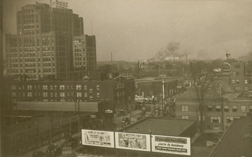
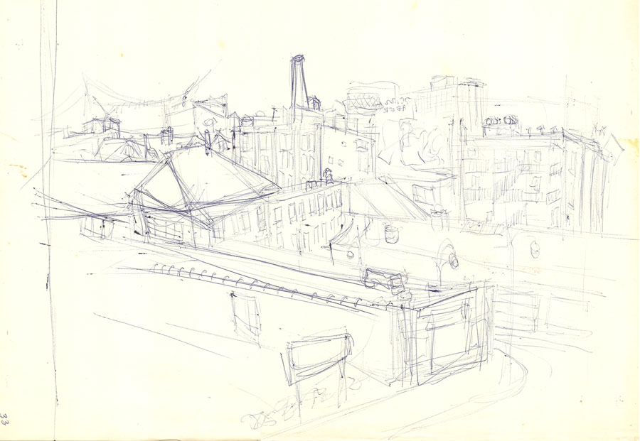
Here is a photograph including 3 signs from the early 1940s and a rough sketch of the same area that I did in 1968. Both were taken from upper floors on Wayne State University buildings looking on Cass Ave. I did the sketch from an upper floor of State Hall. I believe that the photo was taken from Old Main, (the only tall building facing that direction on campus at the time), by my uncle Henry Cleage while he was a student at Wayne.
After looking on Google maps, I no longer think this was taken from Old Main, looking down Cass. I wonder where it was taken from because that is definitely the Macabee building.

The Macabees building on the upper left corner use to hold the Detroit Board of Education. My husband and I went and picketed there the first day we met, in support of the Northern high school student boycott in the spring of 1966. You can read more about that in I Met My Husband in the Library.


Two good reasons to recognize the Macabees building! The 3 signs are interesting — especially that $1.29 shirt!! But that Chesterfield ad makes me want to get out a red pen and do something to make the words parallel. Two adjectives and a verb — I can’t stand it!
Let it go, Wendy. Just let it go.
LOL. I know what you mean, Wendy. It seems people in advertising didn’t need training in the English language, huh?
I can’t let it go either Wendy. I didn’t look too closely at first and just thought they were the names of the girls smoking. Silly me. Now that I know what it says, it does annoy me.
I see four signs…there’s the faded CocaCola drugstore sign on the left. I understand Coke paid for these signs just as they now pay a portion of menu printing costs for restaurants if the Coke logo appears prominently. I like the sketch.
Thanks Helen. There are a couple more signs too small to read further in too.
I went and had a look on Google Earth but could not figure it out with new parking lots and so on. It is an atmospheric photo and a cheerful sketch.
I had the same problem. The more I looked, the more confused I got.
It’s fun looking at the old billboards.
Old signs & advertisements are fun to check out! I like vintage Coke signs but I’m glad we no longer have cigarette signs.
The sketch may be rough but better than I could ever do!
Spend a couple of years drawing and sketching and you’d be surprised what you could do.
I just wish I could draw the way you can! What a wonderful legacy of drawings you could leave for your descendants.
Repeating what I said above, spend a year or 2 drawing and sketching and you will be amazed at how much better you will get.
Wonderful picture and wonderful sketch. I’m still trying to get my head around “What helps business helps you” however!
Goes right along with “What’s good for business, is good for America!” a popular slogan once upon a time.
That’s a very complicated photo for me as I’m not familiar with the city, but I can relate to the large billboards. We have plenty of those.
Those billboards stick out like a sore thumb in that photo!
We don’t have billboards anymore in Maine — what a relief!
I’m with Wendy (parallel construction); Alan’s comment makes me feel better: I don’t understand that sign, either.
It’s interesting to me that in that sepia photograph the most striking aspect are those three billboards. I wonder if they were hand-painted or pasted paper. They look more like pasted paper. Either way, both methods seem to have gone by the wayside in our area, billboards being taken over by electronic boards and signs.
I would guess pasted paper. We still have them around town and on the highway.
I think I may like the rough sketch best!
That $1.25 price for a shirt is amazing!
Great post as always Kristin. Do you think that view looks better nowadays?
The view today looks so different. I could hardly find a similarity. More big buildings and parking structures as the university expands.
Silly me, I was squinting to read the Chesterfield ad , then I realised that you had the ads as your banner! Isn’t it strange how Coca Cola gets in everywhere?